
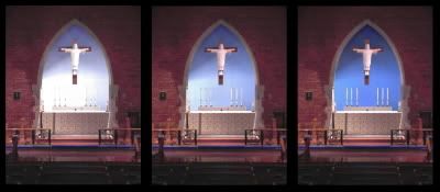
At the recommendation of the flower guild and the worship committee, the wall of the apse here at St. Alban's will be painted blue, probably this week. The motive is to make the candles and flowers stand out better against the background. Blue and red accented with gold are the most common colors for the sanctuary. Of course, we have a lot of red here with the brick. And blue also makes sense for our apse since the archway at the crucifix represents the open gateway to heaven and our columbarium is placed in the walkway of the apse.
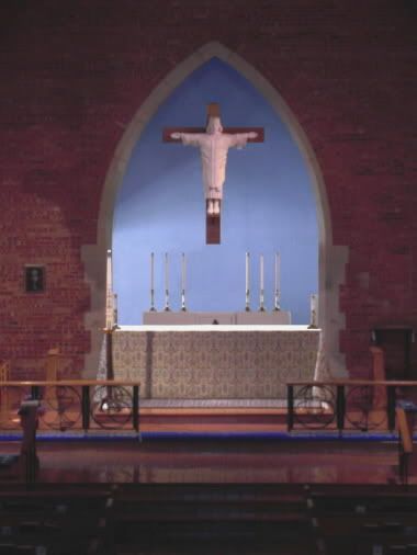
Now the question is which hue is best. I'm inclined toward the idea that darker is better, preferably with some sacred symbols stenciled in gold, but it's also not my decision. Some sample patches have been painted for comparison. The final choice will be a light to medium grayish blue, somewhat similar to the altered photograph below.
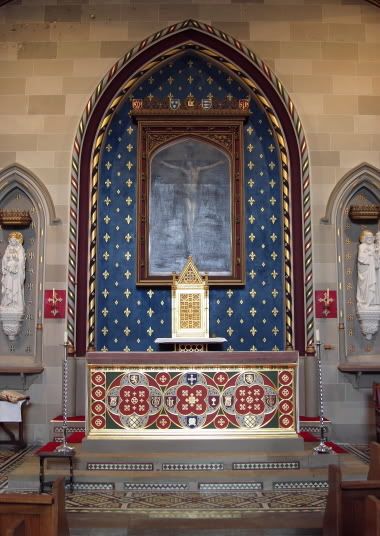
I have added an example of what I refer to above and in the comments about a darker blue background accented with gold symbols like the fleur-de-lis. The picture is of the main altar designed by A.W. Pugin at the Church of Ss Peter and Paul in Newport, Shropshire (UK).

7 comments:
I'm loving the darker shade.
Having grown up at Saint Alban's, I always thought it could use more color and light. My input, however, is that it would be great to go from lighter blue to darker blue beginning with the outline of the crucifix.
Another question is: which symbols would best?
IHS? The Fleur de Lis? The symbols of the four evangelists?
I'm thinking the symbols of the four evangelists, but they are already in the window above. Maybe some stars?
I was thinking a repeated pattern of fleur-de-lis and MR.
I also suggested a great mural of Judgment Day. But I don't know if that would help the flowers stand out.
A la Petrus Christus... that would be awesome. (But would overshadow the flowers).
How about this?
http://www.stalbans-holborn.com/image_of_trinity_in_glory.htm
I think the dark blue looks best. It creates a greater contrast and makes the edges clearer.
I'm probably a little late with my comment, but in the famous words of Don Merideth, "If it ain't broke, don't fix it!" People haven't had any trouble seeing the flowers and candles over the past 40+ years, so why change something as beautful as the altar and surroundings that we already have???
Post a Comment